
Solterra
Orbit Irrigation, a B2B company that manufactures lawn and garden watering products, developed a new private label product line for Project Bounty, an Amazon program. This project included a brand name, logo design, packaging design, packaging graphics, photography, an Amazon store page, Amazon A+ pages, and a review request card.
This project was completed with the Director of Marketing, a Product Line Manager, a Packaging Engineer, a Photographer, and myself as the Graphic Designer.

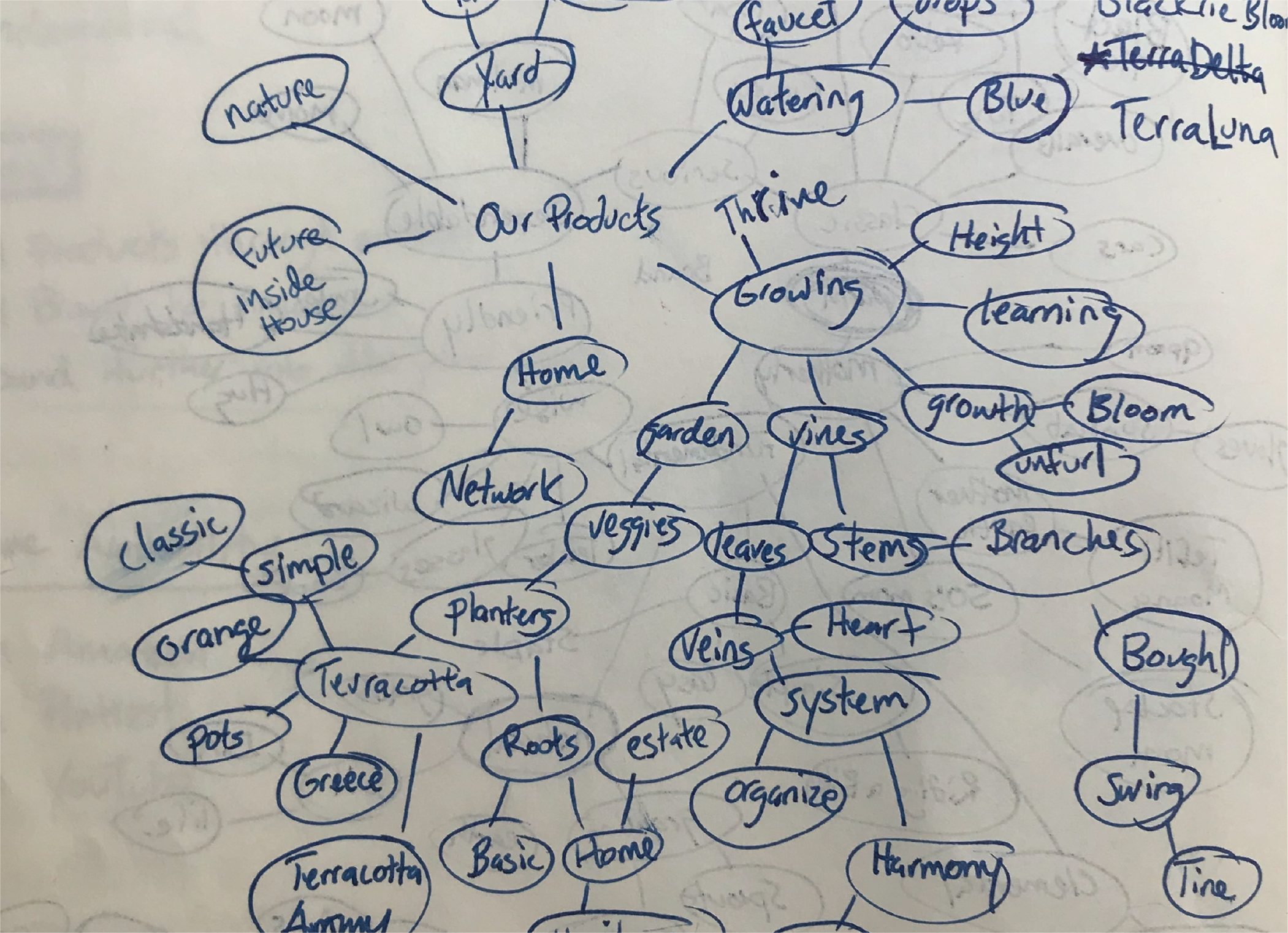
I facilitated the early discussions with the Director of Marketing and the Product Line Manager to establish the brand traits before beginning the naming process. Once the brand traits were finalized, I had project participants create a word map to guide the team towards an acceptable name. Word mapping is a technique that allows your mind to relax and connect different ideas that you may not otherwise notice. I had everyone perform this task separately, allowing the group to have a wider selection of words without being influenced by other team members’ train of thought, before we gathered together to share ideas.
The goal was to narrow down to two names that would give us options to present to stakeholders. The two versions we proceeded with were SunSage and Solterra.
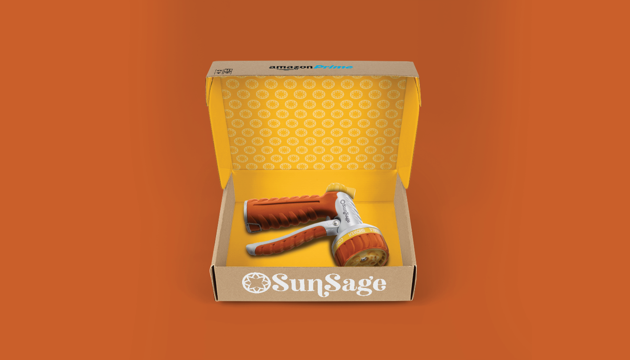
Concept 1
The team wanted a name that reflected the product category and environment that the products would be used in as well as something that indicated Orbit’s expertise and knowledge in hose end products. “SunSage” was chosen as the first concept. For design direction, I was inspired by the yard space. I wanted to lean into the warmth of the sun and terracotta pots and chose an analogous color palette. I wanted the design to feel a little rustic but also playful.


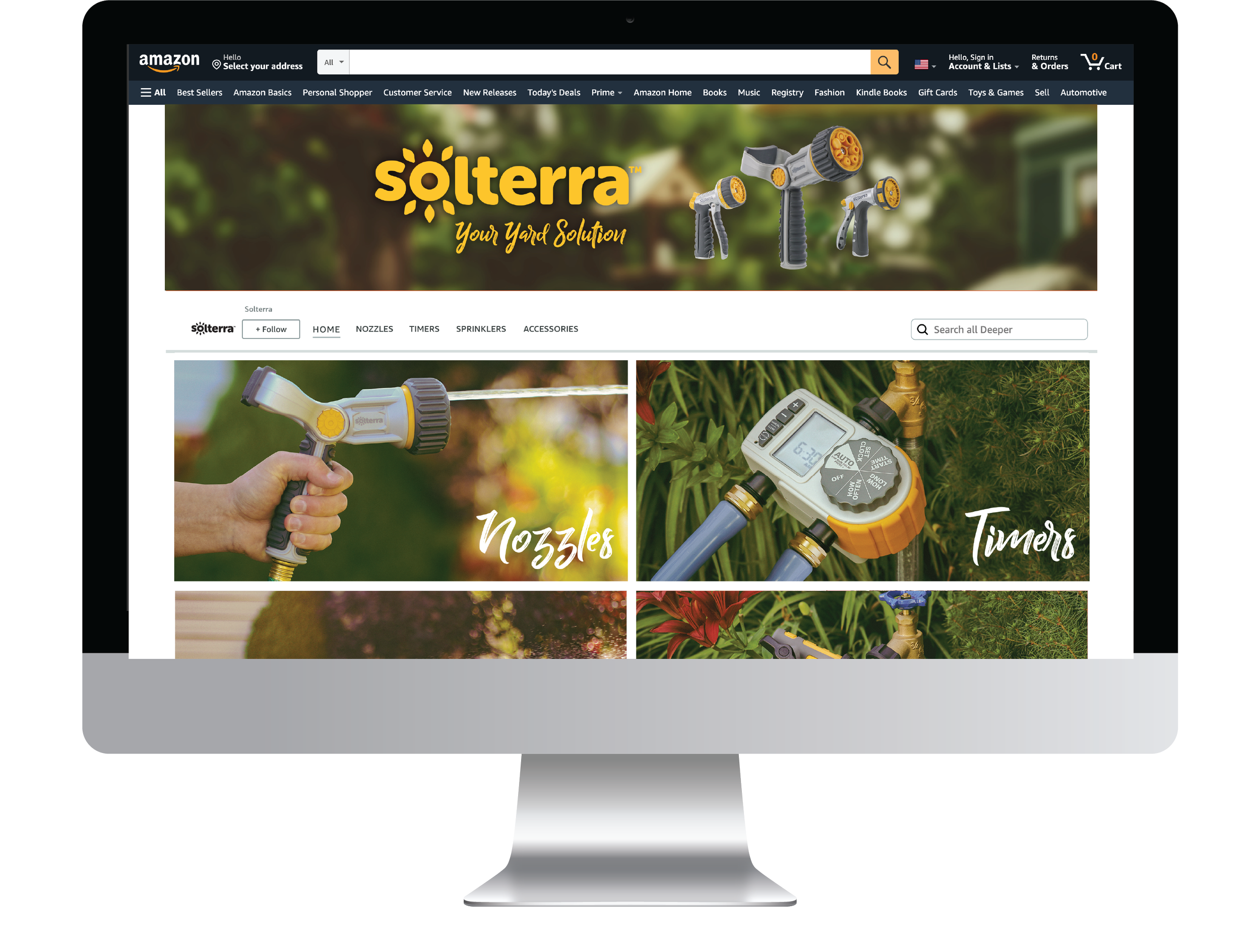
Concept 2
Descriptors for the product category were fully embraced for the second concept by combining words for Sun and Earth. To create a sense of differentiation, this design was more inspired by the product line itself versus the yard environment. Orbit is known as a lead innovator in their category and I wanted this design to feel more modern to reflect their advanced product engineering. I used a clean sans-serif as a base and softened all the corners while also adding elements around the “o” that could be used as rays or seeds depending on the application.
This was the final chosen design.


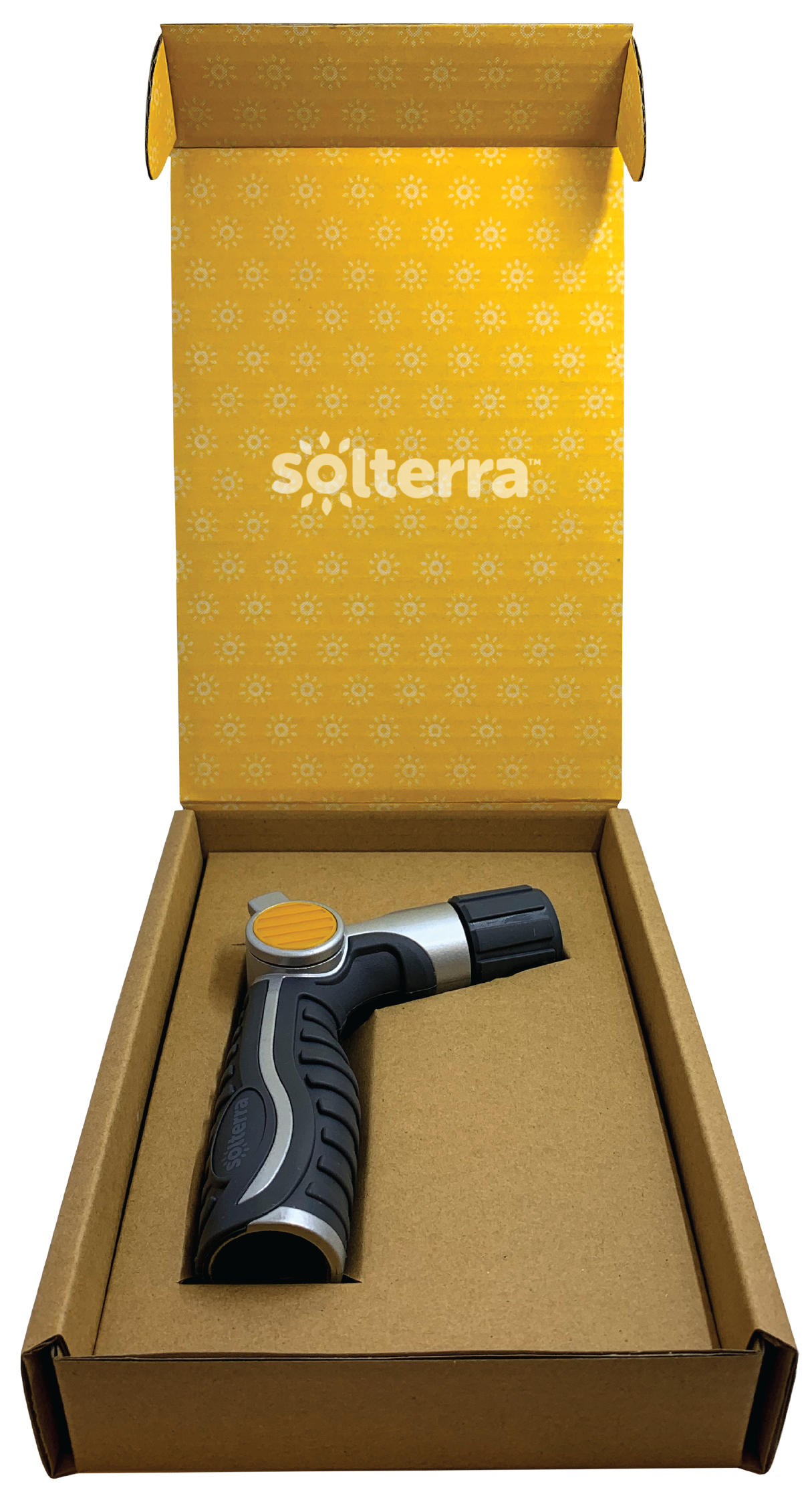


Summary
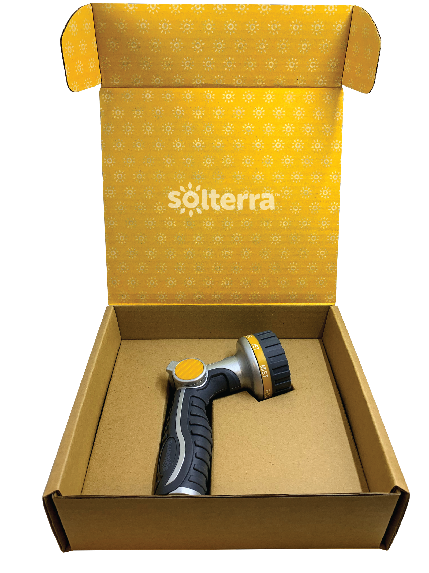
I was solely responsible for the creation of the logo, the mark, the pattern, choosing typefaces, and the Amazon store page and product thumbnails.
The Product Line Manager and I collaborated on messaging and copy for the A+ pages and the review card that was included in the product box. The product boxes and inserts were developed by the Packaging Engineer and I designed and created the graphics.
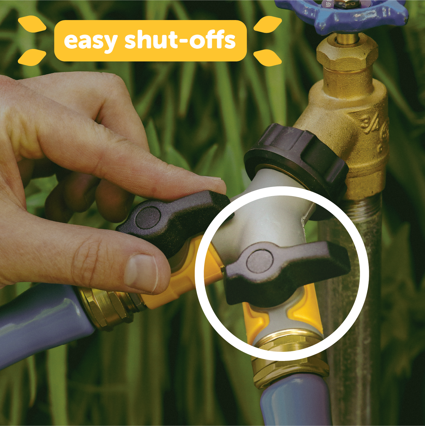
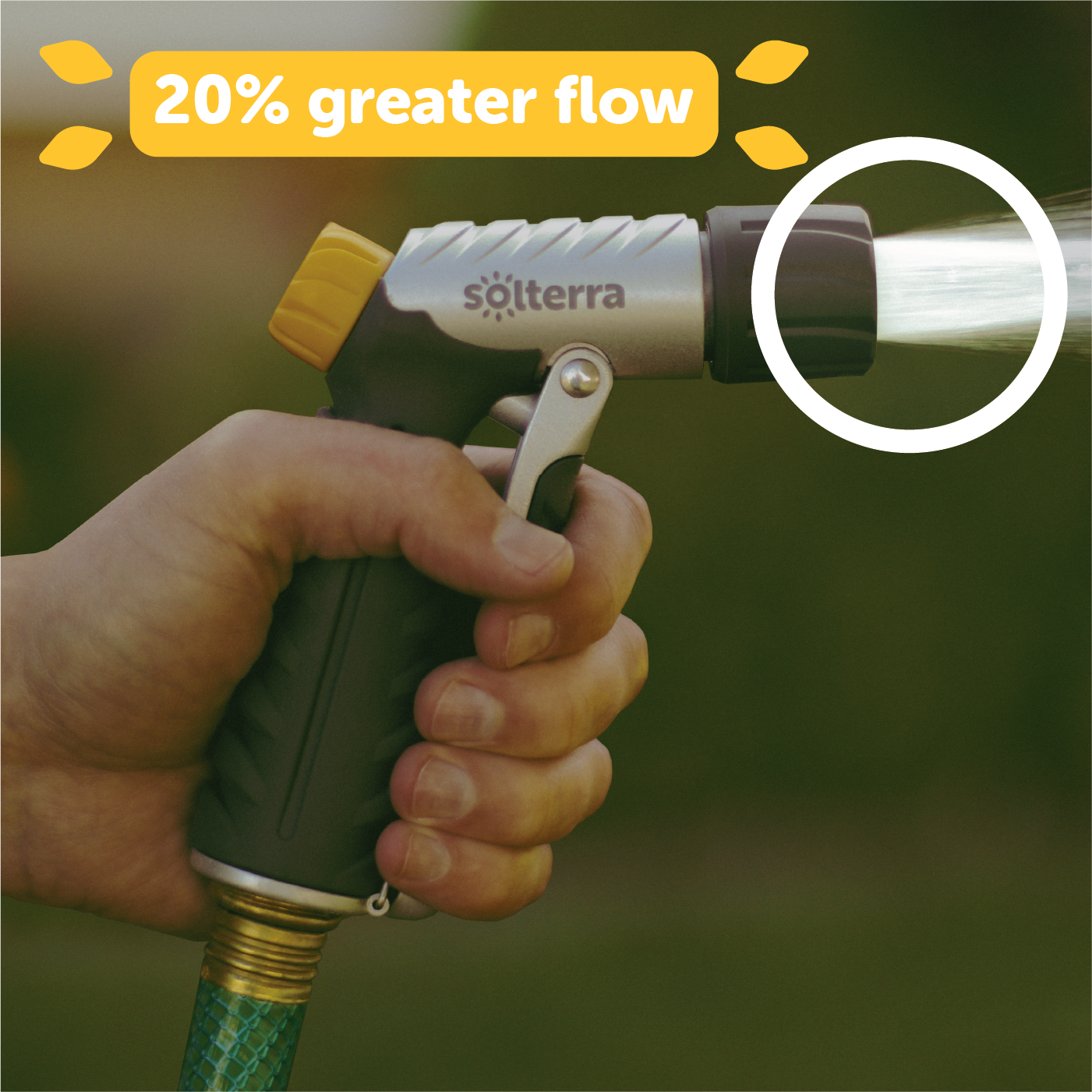
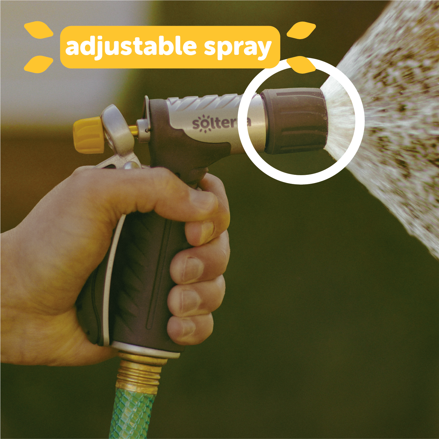
Product and action photography were taken by the staff photographer, after which I edited them using Lightroom and Photoshop to achieve a more consistent look and feel for all of the Solterra products.
