Orbit at Costco
Orbit Irrigation, a B2B company that manufactures lawn and garden watering products, needed updated packaging for a nozzle set that was being sold to Costco. I led the design process while working with a Product Line Manager, a Sales Support Specialist, as well as the Sales manager for the Costco account.
Prior Packaging & Challenges
Orbit has sold items into Costco for over a decade with a new packaging design every year, but there were several problems that needed to be addressed with the previous designs.
Low brand presence
The packaging aesthetics didn’t match that of the product
The design of the pod was being approached piece by piece instead of presented as a whole
Marketing space wasn’t being utilized well with information feeling cluttered and redundant
The three-language requirement made it difficult to identify features and benefits
Initial Concept
After lengthy discussion with the product line manager and the sales support specialist, this was the initial concept presented to Orbit’s sales account manager for Costco.
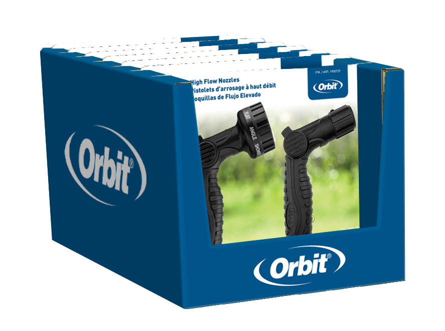
The Orbit logo was enlarged as well as given a greater margin so it wouldn’t be covered when in the tray.
The card front was simplified so the focus would be on the brand, the product, and a primary feature based title.
An less distracting yard space image was used to create a contrasting background for the products to stand out against.
The tray was made darker in a water blue to frame the packaging.
Space on the tray was utilized to push a tagline that reflected the primary feature and benefit of the product.
Large format action photography of the products were added to appeal to more visual consumers
The card back employed a three column layout to address the language requirements. All relevant information can be read in a comfortable flow in one area versus your eye searching the packaging for all information in the consumer’s native language.
Primary feature and benefit tagline is reinforced as a title.
Callouts have been reworked into a feature and benefit format to communicate the product messaging more clearly.
Additional icons support the messaging visually.
Final solution
Additional adjustments were made to the first concept that include
A heavier weight title
A brighter blue tray to fit the summer season
Large logo placement on the tray to increase brand recognition
Product specific call outs were added to the back of card
Summary
I’m proud of the work that was done in this project, both at shelf as well as behind the scenes in establishing a better process for the Orbit team when tackling new designs.
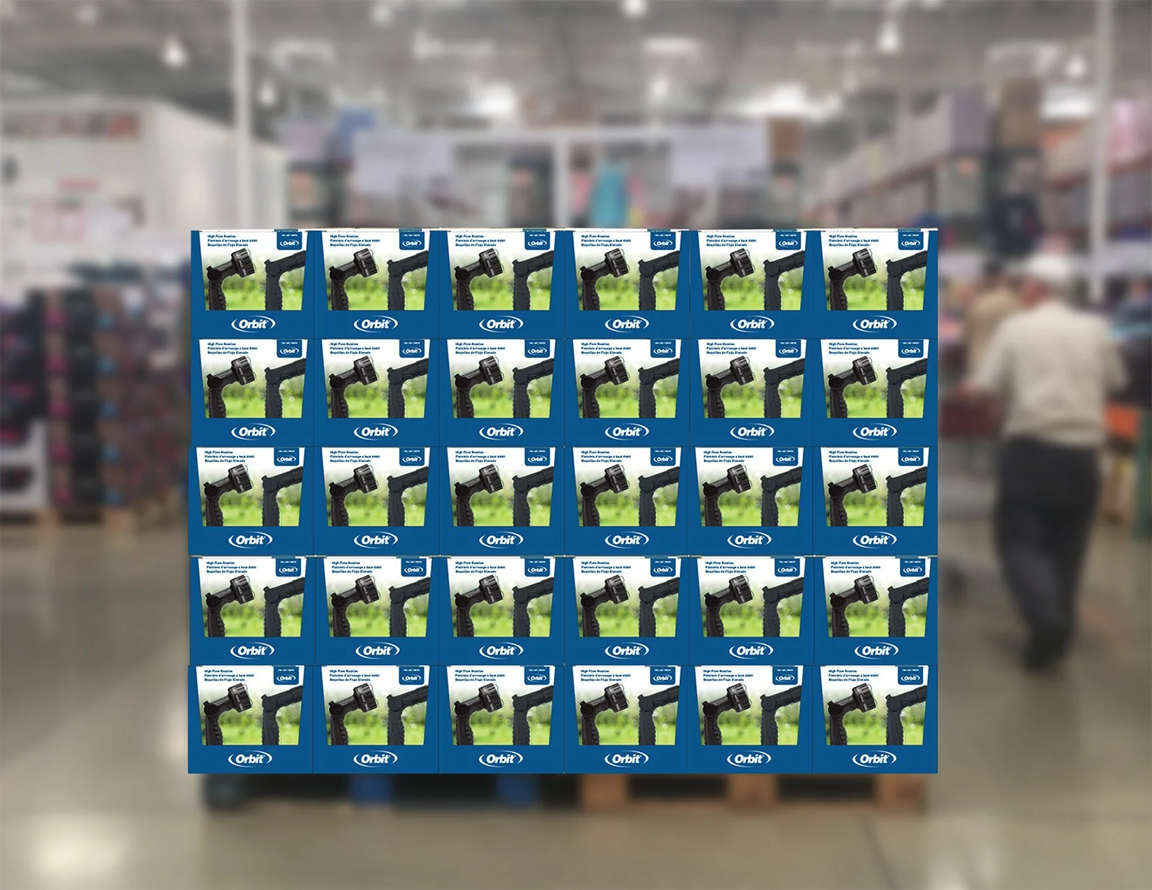
Ultimately, this packaging design was able to break the cycle of Costco requesting a new design every year. This enabled Orbit to have a more consistent brand presence, increasing brand awareness year over year.