
Orbit Classic
Orbit Irrigation, a B2B company that manufactures lawn and garden watering products, developed a new product line of their most popular and established hose end watering products and needed a packaging look that reflected these products as the tried and true staples in the yard space. I led the design process while working with a Product Line Manager as well as the Director of Marketing.
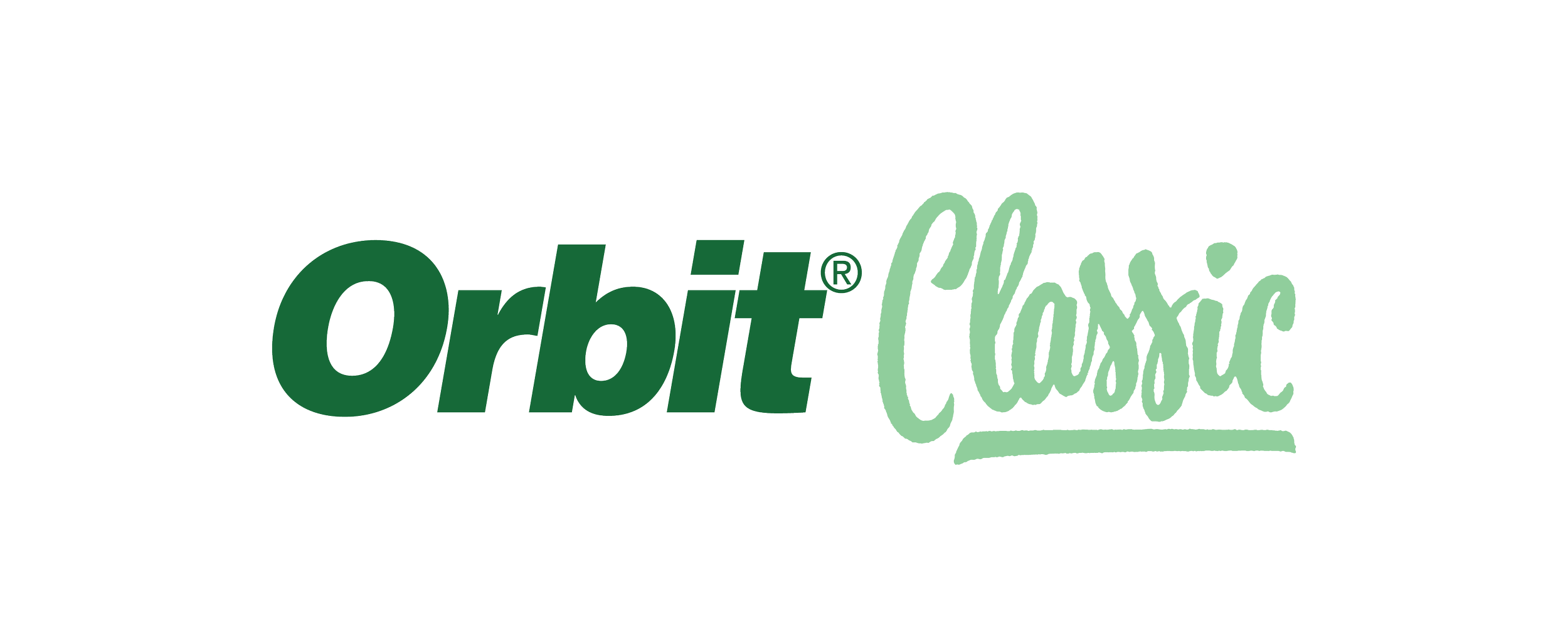
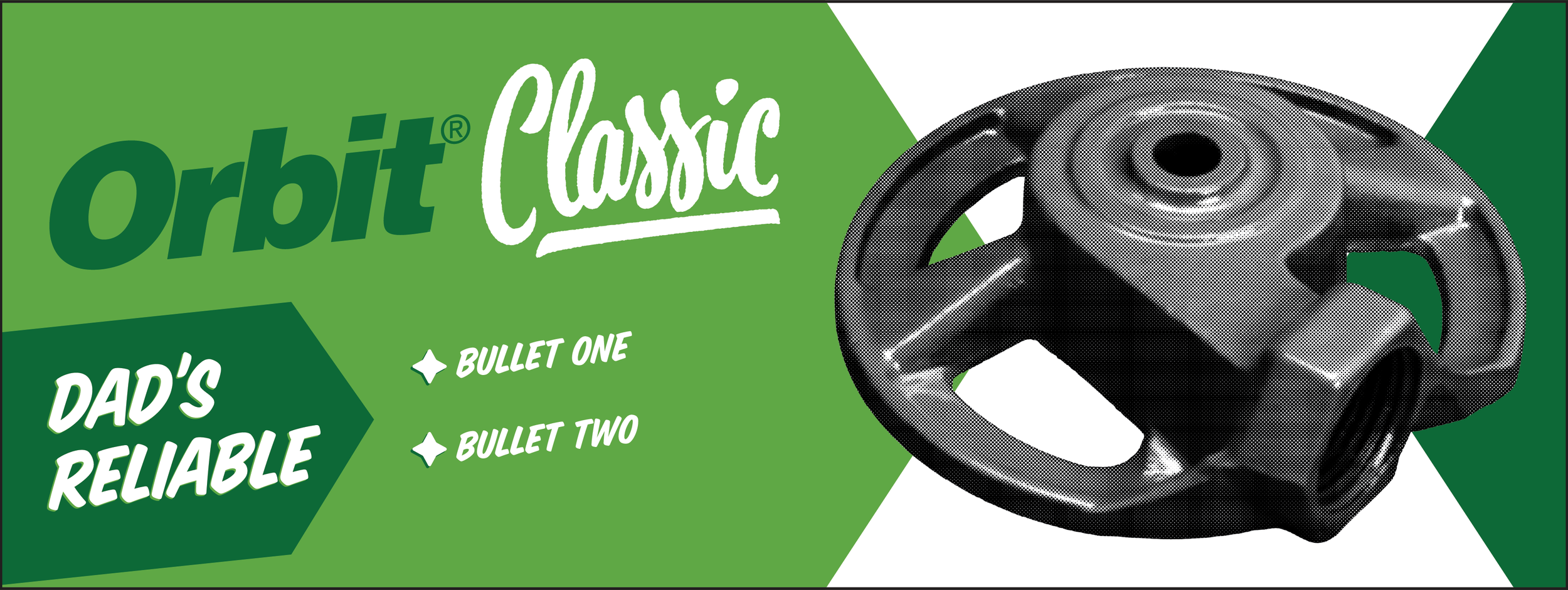
The logo and packaging for this product line was inspired by the 1950's where the "American Dream" was a popular ideation that drove consumers. This retro influenced look emulates common themes in packaging of that era while also imbuing some modern touches to reflect the innovations of the product line.
Initial Concepts
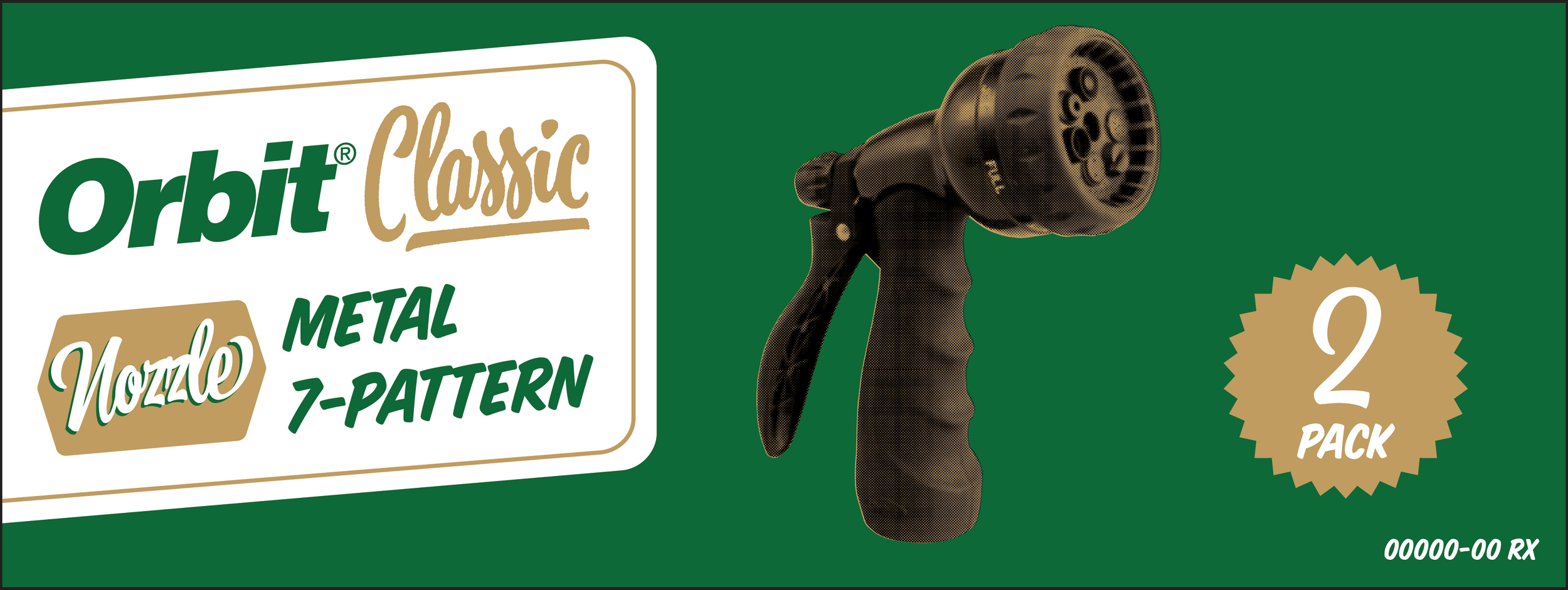
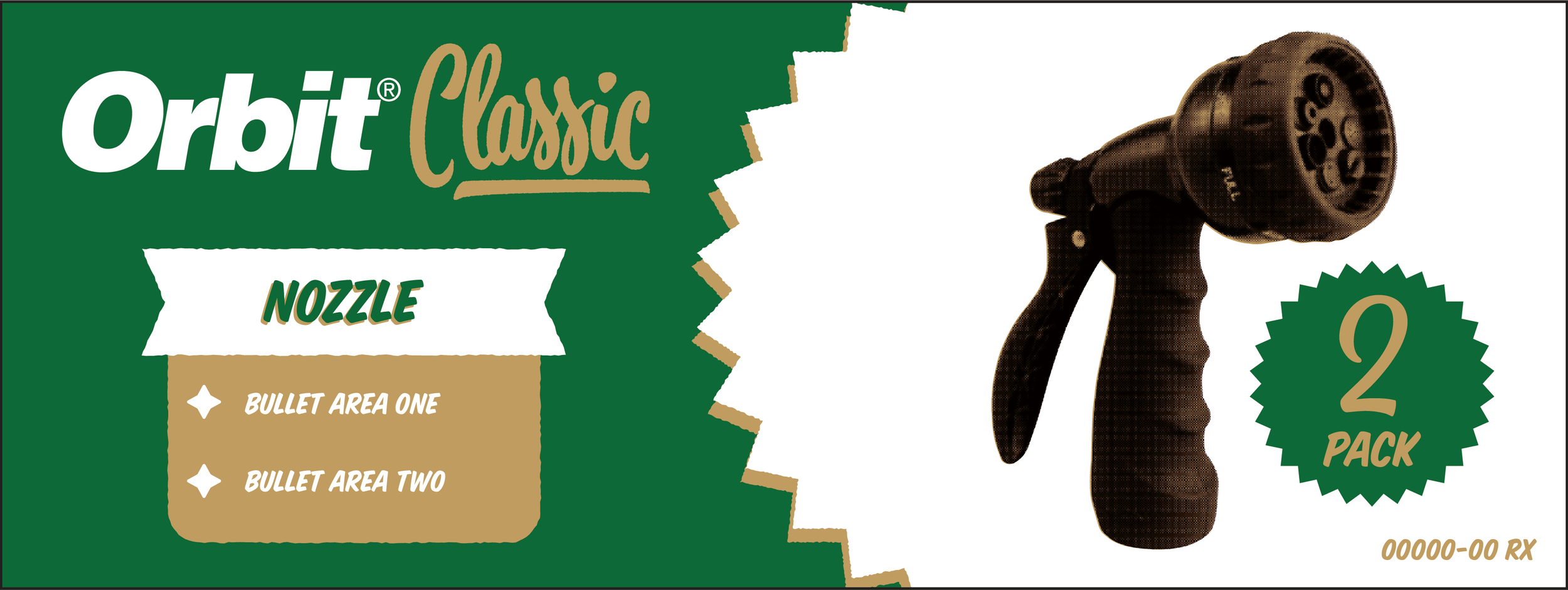

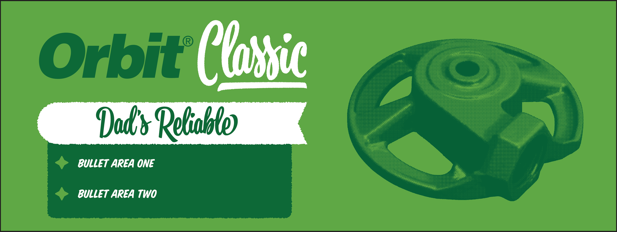
Final solution
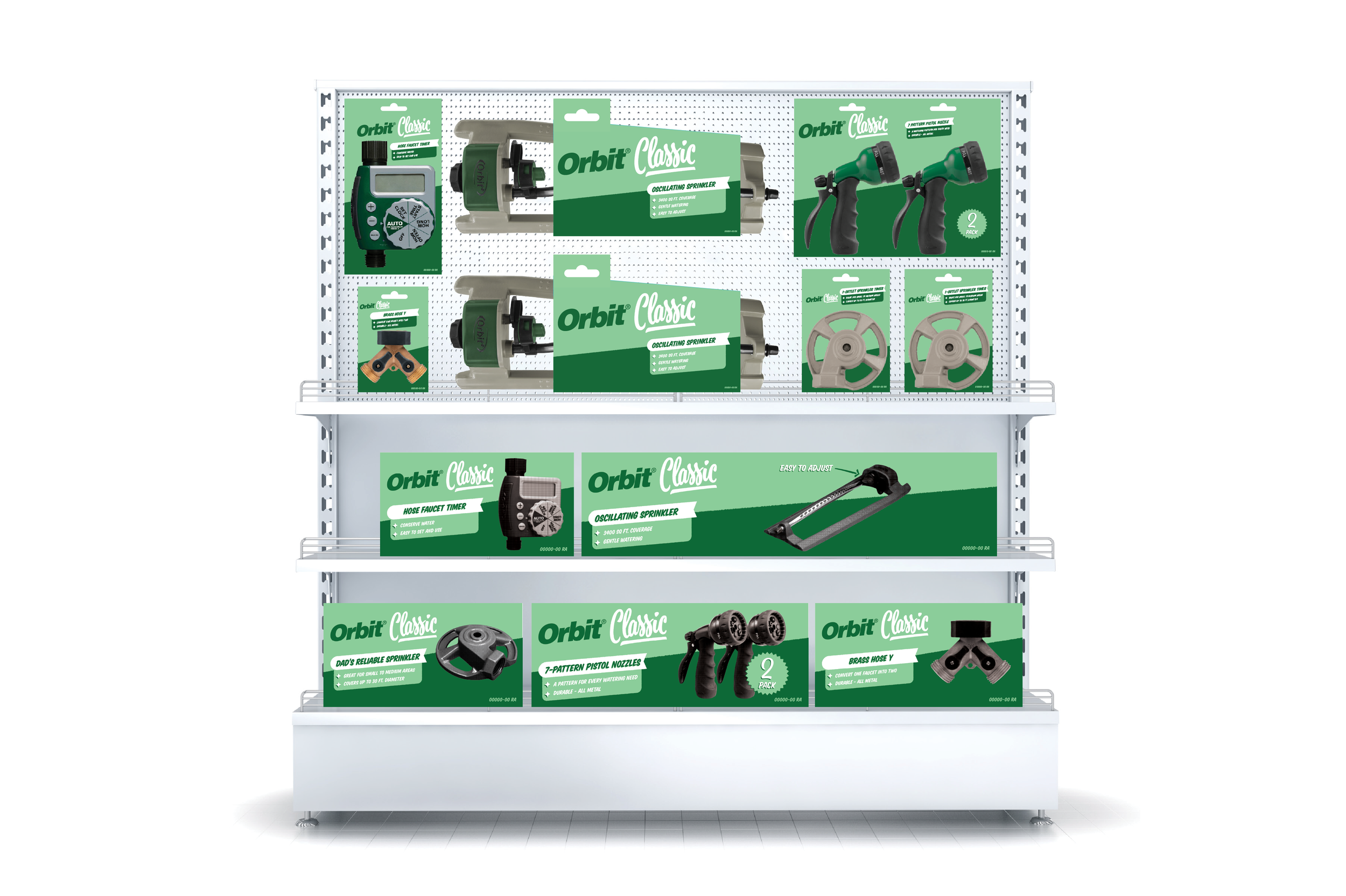
After multiple collaboration meetings, we ended up using the following for the packaging.
One of the problems Orbit faced on some of their other packaging, specifically packaging going into big box stores with their own packaging styles, was less dedicated space for the logo to decrease brand awareness. In this instance, I took advantage of Orbit being able to dictate this packaging design and made the logo very prominent.
The final color palette used Orbit’s hose end green to tie in the product, and a vintage mint. The colors were split diagonally and crossed the midsection of the photography to draw the eye in to the featured product.
Texture was created on the edges of the “classic” portion of the logo and around areas of color breaks. This was done to simulate the less than precise printing effects of the past and a slightly worn and vintage feel.
Product photography was given a newsprint treatment in Photoshop, to imitate the way products were viewed in advertisements of the 50’s.
As these products have been around for several decades, the team decided to simplify the copy to its most digestible form. The title and features were then placed within framing devices to separate the information and clearly communicate the information.


Summary
This was a fun project to work on and explore a style that isn't frequently used in the lawn and garden industry. Ultimately the new packaging included: an Orbit sub-brand logo, newsprint photography treatments, updated color palette, bin labels, and interior packaging. This packaging look and product line was picked up by Ross Dress For Less.
